
")
")
")
")
")
")
")
")

")

")
")


")

")


Alberto Cairo is an educator, freelancer, and consultant in the field of infographics and data visualization. He is currently the Knight Chair in Visual Journalism at the School of Communication of the University of Miami. He is also the director of the visualization program of the Institute for Data Science and Computing.
In the past decade, he has helped companies and educational institutions in more than 20 countries produce better visualizations and infographics.
He is also the author of several books, such as “The Art of Insight” (to be published on November of 2023,) “How Charts Lie” (upcoming, October 2019), “The Truthful Art” (2016), and “The Functional Art” (2013).
Interviewer: Hi, everyone, my name is Gorka Echevarria and today we will be talking to Alberto Cairo. First of all, what is your name? What do you currently do? And what is your professional background?
Alberto: Yes, sure. My name is Alberto Cairo and I’m the Knight chair in visual journalism at the University of Miami, at the school of communication. I am also the director of the visualization and information design program at UM Institute for data science and computing. My background is in journalism and design. I’ve been the director of graphics at Spanish newspapers like El Mundo. I was also the graphics director at Editora global which is the main group of communication in Brazil. I’ve also been a professor at the University of North Carolina Chapel Hill. And today besides being a professor at the University of Miami, I am also a freelancer and also a consultant for governmental organizations like the Congressional Budget Office, international organizations such as the World Bank, and Euro stat, and also companies like Microsoft and Google. And I’m also the author of several books about visualizations such as functional art, truthful art, and also how charts lie. And my new book comes out on November 15th this year, the title is The Art of sight. That’s sort of like long story short.
Interviewer: What is your relationship with data and how has access to data changed in the past two or three decades.
Alberto: Oh oh, yah yeah yeah, so yeah the increasing accessibility and availability of data in digital format has affected the world of journalism in a very dramatic way. It has changed the way that journalists do their jobs. And it has also facilitated the creation of new professional profiles in the newsroom;, data developers, data visualization designers, data journalists in general. So it has had dramatic effects in our profession. In my own life, obviously, I mean, I have devoted the last decade and a half of my career to working in data visualization. That’s what I have been doing for the past 15 years, even writing books about it. So obviously, it has had a huge impact. Yes.
Interviewer: What is the key to making data accessible so that everyone can understand it?
Alberto: So I honestly don’t know, if there perhaps is a multi strategy, strategy or a multi tool strategy, right? It’s not there is not just one way, the challenge is not only to make data accessible, but also to make data understandable. And in order to do that, you need to educate the public in how to read it and how to use it, you need to provide context, you need to make the data easily downloadable, easy to visualize, easy to present. But it’s sort of like a bi directional effort. It’s not just the challenge that is in the hands of people who produce the data, and who put the data out for the public to consume. It is also a challenge that depends on the public to be educated enough or knowledgeable enough to interpret that data correctly. And in order to get there is not. I mean, it’s an effort that requires sort of like a societal approach, in the sense that, you know, the the basic the K 12 educational system, for example, needs to speed up a little bit in training students and teaching students how to interpret numbers correctly, instead of focusing just on you know, a rod calculations, for example. Statistics for example, teaching his students how to interpret it is key to the accessibility of the data without at least a working understanding of how statistics work, you can not understand data.
Interviewer: do you think a good use of data can help battle misinformation?
Alberto: Sure, yes. But it can also be part of misinformation itself. But it’s actually what he said in the previous question, right, when you have a public that is not knowledgeable enough to handle data that opens the door to tons of misinterpretations of those numbers, right, crazy interpretations of those numbers. So yeah, sure. But, you know, if the public is knowledgeable enough to interpret the data correctly, and that data is correctly presented by the people who generate and put the data out, then for sure, yeah, it can be a great tool to provide empirical evidence for assertions and stories.
Interviewer: During the pandemic, there was a lot of data coming from all around the world. Do you think that this data was well managed? And was it a good thing?
Alberto: So I have mixed feelings about it. On one hand, I think that it was inevitable that that data was made available. And it needs to be made available, like contagion data, cases, data, death rates, and so on and so forth, is not only inevitable, I mean, its that that data doesn’t belong to the people who generate the data, it belongs to the public, it needs to be pulled out. So on one hand, that is a positive development. On the other hand, in hindsight, I wish that the data was not necessarily better visualized or better presented, but better put in context, better explained to the public. Now, that said, also, it is very easy for anyone to criticize in hindsight, right? But we are when we are sort of like in the heat of the moment when we are in the middle of the pandemic, trying to generate it for the public to consume. That’s a huge challenge. So I tried to put myself before criticizing anyone, I tried to put myself in the shoes of people producing the data and producing the representations of the data. And I sometimes wonder whether I would have done a better job than they did. And perhaps the answer is no, I would not have done a better job than they did. But in hindsight, if I had looked at myself in the past, maybe I would think, you know, maybe next time, I should be a little bit more careful not throwing data, a huge amount of data to the public, but perhaps making the data available, we should not hide the data. But at the same time, the first thing that we should present is a summary of the data in which we present the main insights from the data, rather than putting all the data out at first, right? We shouldn’t, we should never conceal the data, the data needs to be made available. Transparency is a mandate to anyone who produces data of that type. But at the same time, the way that we present the data really matters.
Interviewer: Can data be interpreted in different ways? And does that make it vulnerable to being manipulated?
Alberto: Yeah, yeah, that’s actually one of the main misunderstandings that I tried to fight against, related to very well known sayings such as you know, that data should speak for itself or show me the data, right, let data speak for itself, right, all that type of thing. All those things are completely wrong, data never speaks for itself. And data is not self explanatory is the same thing as reading a piece of text, right? Text reading texts can be interpreted texts can be interpreted in different ways the same message the same written message can be interpreted differently depending on who approaches that text because we all bring our own assumptions, our own mental models, our own schemas, mental schemas, to whatever we see. And we, understanding happens through the interaction between what passes through our brain and what already exists in our brain. That happens when we write, that happens also, when we see data presented to us, so obviously, yes, data can be ambiguous. Data can be misunderstood very easily; data is not univocal. It can be equivocal, it can have several meanings depending on who reads the data.
Interviewer: can you talk about a project of yours that you were part of, or one that is meaningful to you or that stands out?
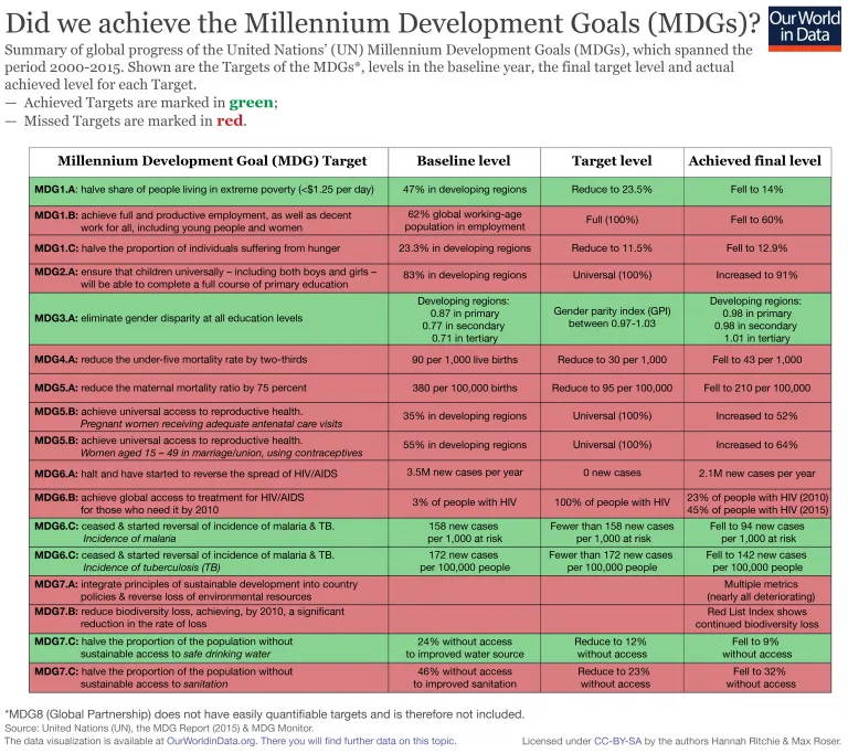
Alberto: Yeah, I can talk about our recent one, and I can talk about it because he has just been released today. So very recently, I was I was an art director for a series of data visualizations developed by Microsoft to be displayed at the United Nations at the headquarters of the United Nations Big Data, posters summarizing a results, sorry, data related to human development, to the, to the to the Millennium Goals so to speak. And that was a huge project, you know, I was super happy to be involved in it. I didn’t produce the graphics myself, I simply oversaw the production, and I directed that project. So that’s probably the most recent one.
Interviewer: Well, thank you very much
Alberto: Thank you
")
")
")
")
")