
")
")
")
")
")
")
")
")

")

")
")


")

")


Between 1987 and 2018, there was a struggle to interest students from different races, ethnicities, and gender groups in the computer science field. Dr. Stephanie Lunn and her team worked on organizing the demographics. Her main focus was on seeing if the change in trends over time caused the struggle for participation in different groups of students because women are a minority in computing. She researched the historical context of major events such as political, social, and economic changes that created the struggles of each group to become engaged.
Listen here:
Introduction: My name is Dr. Stephanie Lunn. I’m an assistant professor in the School of universal computing, construction, engineering education as well as the stem transformation Institute. And I also have a secondary appointment, and the Knight Foundation School of Computing and Information Sciences. My background is such that I started off in neuroscience, I have a Bachelor’s and Master’s in neuroscience, I ended up working in industry, where I was in a healthcare field and doing a lot of data analytics around providers, and network composition and contracting and things like that.
Working with data: So I first started with data analytics, in a neuroscience sense with experimental data then moved into a healthcare context. I was then working as the marketing director for a scientific supply company. And so analytics were completely different in a marketing context or business context. And I ended up for that role, there was features I wanted to add to the website, and I just fell in love with coding, I ended up going back to school for computer science. So I got another bachelor’s, master’s, and my doctorate in computer science. And then I did a postdoc and biomedical engineering department, before becoming a professor, so I have experience with data analytics across fields. And for me, it ends up being something that it really depends on the research questions you have and what you’re trying to get out of it. So thinking about the goal will often determine whether I’m using an existing data set or whether I need to create my own or find another alternative, depending on what it is that the goal of the project is, one of the studies that I had worked on in the computing education domain, was trying to look at trends in computing over time. And while there may be a lot of data sets together, or that exists already in computing, oftentimes demographics are considered in terms of an individual’s gender identity, or their racial or ethnic identification. And being able to track trends over time isn’t something that many existing data sets currently offered.
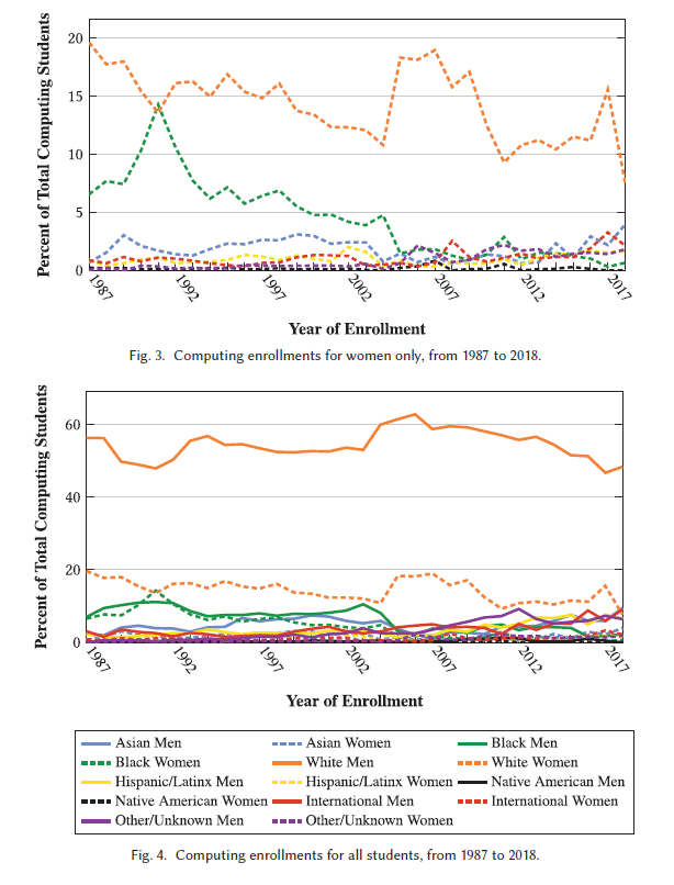
Introduction of data project: The chart that I shared, use the multi or multiple institution database for investigating engineering, longitudinal development, which is called midfield. And this is a longitudinal multi institutional database that we were then able to use to disaggregate and to look at the intersection of both race or ethnicity and gender identity. And then try to understand trends in computing over time. So seeing how we may see changes in enrollments. And within that same paper, we also looked at graduations, but trying to gather evidence around understanding what demographics have looked like over time in terms of participation in computing. And it has student level and curricular level records, or obtained across many institutions over time. So I think it has 19 different institutions and records for 1.5 million undergraduates. And it includes different demographic information, academic information about things like students majors courses, taken grades, graduation rates, and it started data collection in 1987, and added a number of new participating institutions annually. So it is a very, very large data set that allows the analyses of disaggregated data to extract insights. So it was chosen because it had the kind of data we were looking for. And we could stratify it using classification of instructional programs, or CIP codes, for computer and information sciences to try to look at computing students specifically.
Stephanie’s major focus on the project: For me, as I was working on my dissertation, I was looking for numbers where I could say this, about the participation of women that identify is marginalized in computing. So women are already minoritized in computing, but when you look at the intersection of gender, race and ethnicity, you see very different trends. And I wanted to be able to make that case over time. And so and to understand the historical context. So the idea was that we could perform a historical context analysis around where we see changes in trends over time and trying to look at what major events could correspond to shifts in participation.
Collection of data: And so the first step towards that was, we know that here is what we see in the demographics of the United States currently. But what does that actually look like in computing for different populations? And how has that changed over time? So it was a very deliberate decision to recognize that the current like the computing research association may have some of this data. But they’ve only begun to look at it this way more recently. So if you wanted historical trends that just wasn’t available. And so there was a lot of limitations and other existing data sets out there for us to gather that information. So we elected to take this approach so that way we could answer the questions that we had. White men tend to be the predominant group that dominate computing enrollments across time. Whereas white women are much lower in that participation. And then we see all of the other black women, Hispanic or Latinx Men and women, Native American women. And some of the terms were just based on what was already in the database. So it wasn’t necessarily that I defined those demographic categorizations. But the idea was that we were able to understand where we see these disparities in participation. And it helps us to provide evidence as I was going forward, around, what do we see? And what are the trends? And what can we point to for different populations.
Analyzing the data: So I will say there was a number of surprising findings, we saw certain increases in the trends over time and decreases. I knew that, for example, women’s participation was going to be you know, just over time, we hear anecdotally how women have participated at lower rates than men in computing over time. But there were some trends in the I think it’s like late 80s, early 90s, where we saw a spike in the participation of black women. And so that was a really interesting finding. And it led us to try and understand what policies or historical events could have had an influence that could have shaped something like that, which we were observing. And so, trying to understand, when we saw, hey, we’re actually seeing more black women that are participating than white women at this one point of time. That was kind of an exciting thing to think about. What is it that could have shaped the or could have had an influence that we could consider is there a way we could leverage this information to make suggestions going forward to try to think about how we can broaden participation in computing, we wanted a way to be able to see each of the different groups clearly, and not have too much overlap.
Data category desing: And I will say that there was some attention given to the fact that there’s certain stereotypes with colors that people already make. And so there was an attempt to try to avoid that, like, it seems it could be offensive, or problematic or biased or discriminatory, or whatever you want to call it, to use the black line to represent those who identify as black. Or if we use Asian, to use a yellow line. So things like that were deliberately chosen for other groups, because we didn’t want to lead to those perceptions or to reinforce some of those stereotypes or things that could be problematic.
Trial and error of data chart design: I think it’s sometimes really hard when you have a lot of different data that you’re trying to represent in the same figure. And so oftentimes, decisions are made around what’s going to have the most contrast, so the readers can easily see all of these differences. And so it ended up being a lot of different colors. But the idea was we had toyed with some other options. And if they were too similar, it was just too hard for the AI to discern what the trend was for a particular group. So it was a bit of trial and error to the will say that there’s a lot of importance around making things large enough so that it can easily be visualized. Thinking about the approach, you’re taking what makes the most sense whether it’s a bar chart, or line graph, or something else entirely. There’s a lot of different visualization tools out there. And I think oftentimes, it does require some critical thinking around what may make the most sense for what it is you’re trying to present. And what will make that the most clear for your reader. For example, gridlines, were too much going on, there already was so much going on with all the different colors. So we decided not to go with an overall grid. But if you notice, there are gray lines just to track to make it easy to identify like 60%, or 20%. And so that way, it makes it easier to recognize, wow, all of these numbers for women and for a lot of these other intersectional populations of women and men are all under 20%.
Updating the data: The data base, the owners have since sold it. So it was funded by a grant, the grant has since ended, someone else has purchased the rights to this. It may not be publicly available. There’s been changes in CIP codes in recent years, the data would need heavy cleaning and figuring out how to reconcile the older CIP codes with the current CIP code. So there’s a lot of those variables that would come into play if we wanted to continue with more recent data. And for those purposes, like I said, Now we have seen that only in the past couple of years have others like the CRA taulbee surveys are often a source of computing demographics, and they have started to approach data intersectionally. So I don’t necessarily know that I would consider this a problem currently, so much as when we were trying to look at this historically it was important for what we were doing.

")
")
")
")
")